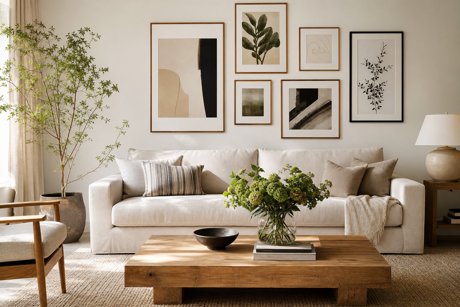
A strong gallery wall does two jobs at once: it fills a blank surface and gives the room a point of view. If you want to learn how to create the perfect gallery wall (step-by-step), start by treating it like a design project, not a last-minute collection of random frames. The best results come from planning scale, color, spacing, and mood before the first nail goes into the wall.
A gallery wall usually works best on a surface that has clear visual boundaries. Good candidates are the wall above a sofa, bed, sideboard, stair run, desk, or entry bench. Aim to leave at least 15-25 cm of breathing room between the outer edge of the arrangement and nearby architectural lines like ceilings, door frames, or shelving. That margin keeps the composition intentional rather than cramped.
Start with the Wall and the Mood
Before choosing art, define the room's mood in one sentence. "Calm and tonal" leads to a different mix than "eclectic and collected" or "graphic and high-contrast." In living rooms, soft neutrals and layered textures often suit larger arrangements. In home offices, sharper lines and bolder contrast can hold their own against desks, shelving, and task lighting.
The wall itself tells you what scale to use. If you're hanging above furniture, the overall arrangement should usually span about 60-75% of the furniture width. Over a 200 cm sofa, that means a gallery wall roughly 120-150 cm wide. Much narrower and it looks under-scaled; much wider and it starts to float awkwardly beyond the furniture below.
If you want a calm starting point, browse our Minimalist collection or layer in soft tonal pieces from abstract wall art with gentle texture. For a more collected, classic look, fine art prints add depth fast because they already carry visual history and painterly detail.
Choose a Cohesive Mix of Art
A gallery wall looks polished when the pieces share one clear thread. That thread can be color, subject, era, frame finish, or even negative space. You do not need every piece to match. You do need them to relate.
A reliable formula is 60/30/10. Use 60% of the wall for your core style, 30% for supporting variation, and 10% for contrast. For example, 60% soft neutral abstracts, 30% architectural prints, and 10% typography gives enough tension without visual noise. If everything shouts, nothing leads.
This is where mixing categories helps. Pairing architectural wall art with typography prints creates structure, while one or two textured abstracts soften the edges. In a quieter room, tonal pieces such as White Cream Texture Poster or Textured White Abstract Poster keep the arrangement layered without becoming busy.

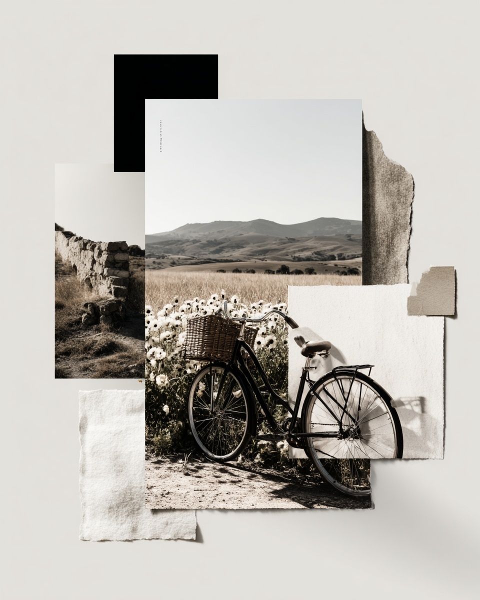
For a gallery wall with variety but a consistent palette, choose no more than three dominant colors and repeat each at least twice. Black, off-white, and muted sand are enough for a sophisticated arrangement. If you want more energy, bring in one stronger accent — dusty blue, terracotta, or olive usually works well without overwhelming the wall.
A practical four-piece starting set might combine texture, architecture, painterly softness, and pattern:



Plan the Layout Before You Hang Anything
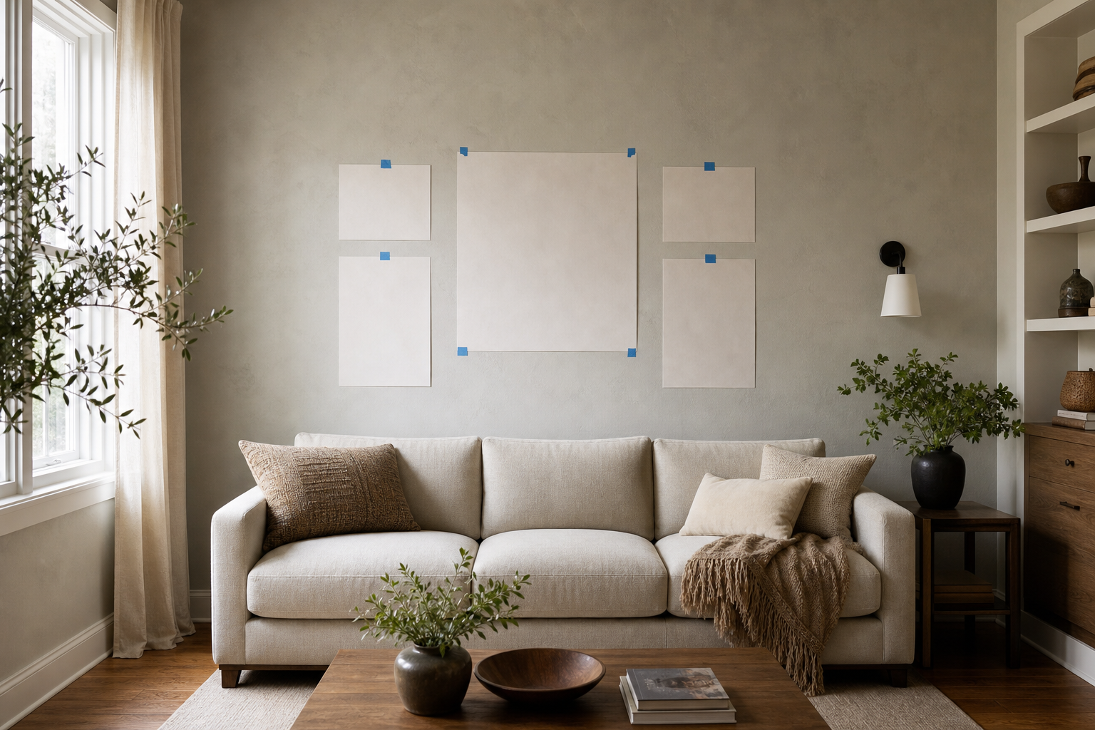
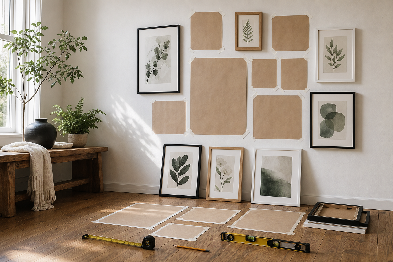
This is the step most people skip, and it is the reason so many gallery walls feel uneven. If you want to master how to create the perfect gallery wall (step-by-step), plan the full composition on the floor first. Measure every frame, then map the total width and height with masking tape on the wall.
Paper templates save time and patching. Cut kraft paper or newspaper to the exact size of each frame, label each piece, and tape them up. Start with the largest item slightly off-center — not necessarily in the exact middle — then build outward with medium pieces and finish with the smallest. This creates a natural hierarchy.
Keep spacing consistent. For most gallery walls, 5-8 cm between frames is the sweet spot. In tighter, modern arrangements, 4-5 cm looks crisp. In looser, collected layouts, 7-10 cm can work, especially with larger frames. The important thing is repetition. Random spacing reads as accidental.
Visual weight matters more than matching dimensions. A dark print in a 50 x 70 cm frame can feel heavier than a pale 70 x 100 cm piece. Spread darker, denser works across the layout so one side does not sink visually. If you are mixing vertical and horizontal art, place one or two landscape pieces near the outer edges to widen the composition.
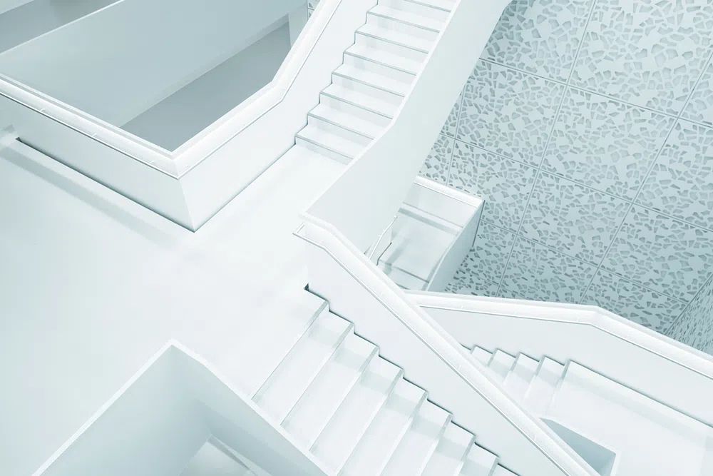
One of the easiest anchors for a modern layout is an architectural print because straight lines stabilize the group. A piece like Modern White Staircase — Minimalist Print works especially well when surrounded by softer forms and painterly works.
Pick Frames That Tie It All Together
Frames are where separate pieces become one composition. The simplest route is to keep the frame finish uniform — all black, all oak, or all white — and vary only the art. This works especially well if your collection mixes abstract prints with Starry Night — Fine Art Print or other more detailed works.
If you prefer a more layered look, limit yourself to two frame finishes. A common ratio is 70% one finish and 30% another. For example, mostly matte black with a few natural oak frames feels edited. Once you add a third finish, the wall needs a very clear reason to hold together — otherwise it starts to drift.
Matting makes smaller art feel more substantial. A 30 x 40 cm print with a 5-7 cm mat can hold presence next to a 50 x 70 cm unmatted piece. Mats also help unify art styles that would otherwise clash. If one print is busy and another is spare, equal mat widths can make them feel related.
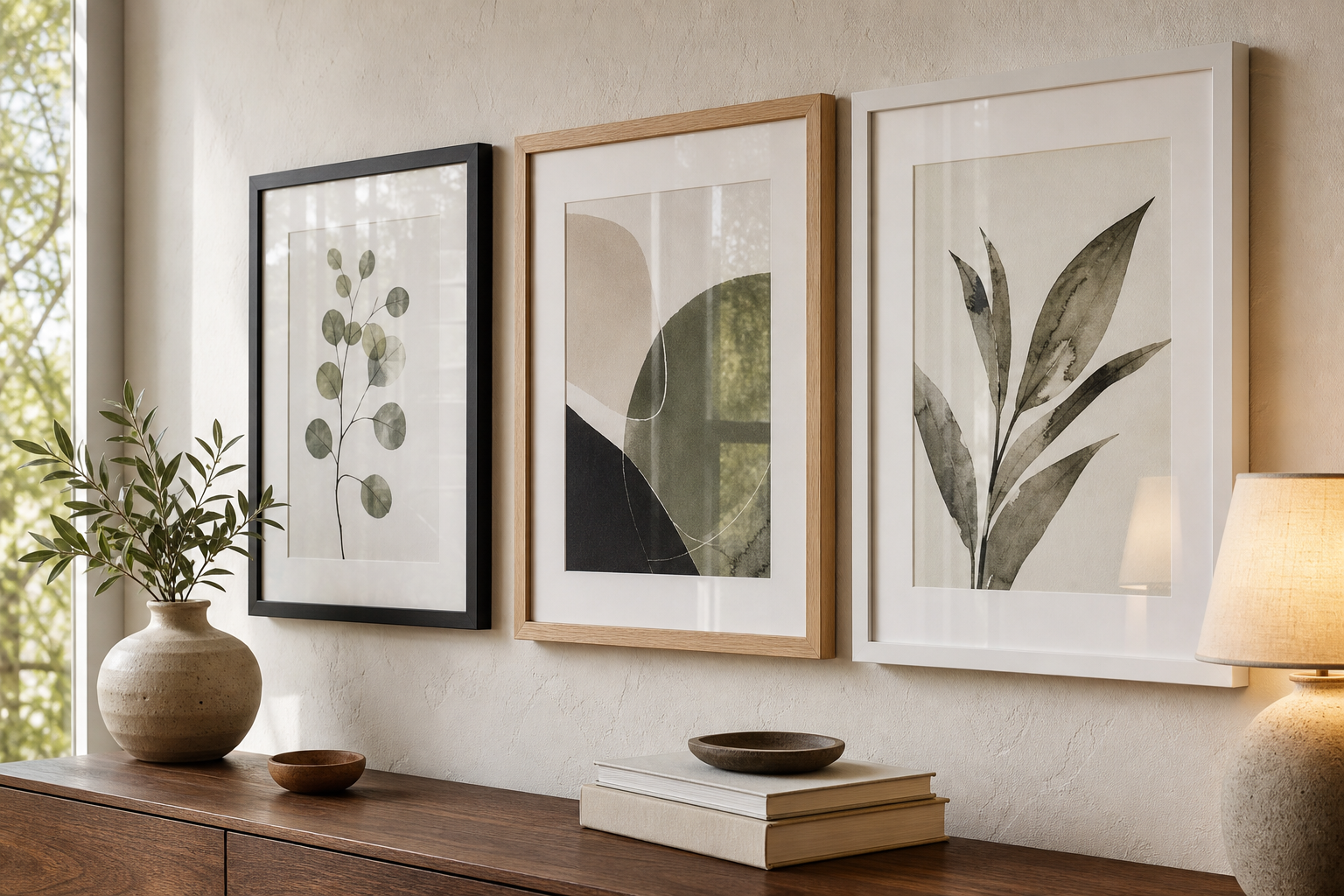
For softer interiors, slim oak frames pair naturally with pieces from our Bohemian collection and tonal minimalist art. For sharper, graphic rooms, black frames sharpen everything — especially line-heavy architecture and typography.

Hang It Like a Pro
Once the layout is fixed, mark the center of the whole arrangement on the wall — not just the center of one frame. In most living spaces, the center of the composition should sit around 145-150 cm from the floor. Above furniture, keep the bottom of the arrangement about 15-20 cm above the sofa, headboard, or sideboard. That gap visually connects the gallery wall to the furniture below.
Hang the anchor piece first. Then work outward, checking alignment every two or three frames instead of waiting until the end. Use a level, a tape measure, and wall-safe painter's tape as temporary guides. If frames have sawtooth or wire hangers, measure the exact drop from the top of the frame to the hanging point. Most hanging mistakes happen because people mark the frame edge instead of the hardware point.
If your arrangement includes nine or more pieces, install it in rows or vertical clusters rather than jumping around the wall. That gives you a cleaner rhythm and makes small adjustments easier. For rental spaces, adhesive strips can work for lighter frames, but once you reach larger sizes such as 50 x 70 cm or 70 x 100 cm, proper hooks are usually more secure.
A helpful final check: step back 2-3 meters and take a photo on your phone. Crooked lines, uneven gaps, and weight imbalance show up faster on screen than in real life.
Style, Edit, and Evolve Over Time
The best gallery walls are not overfilled on day one. Leave a little room for adjustment. A composition with 8-12 pieces often looks stronger than one forced to 15. Empty wall space is part of the design — it gives the eye a place to rest and makes the art feel chosen.
If you want to refresh the arrangement seasonally, swap one or two prints rather than replacing the entire wall. That keeps the structure intact. In spring and summer, lighter pieces such as Blush Watercolor Abstract Poster can lift the palette. In autumn, richer textures or architectural shadows create more depth.
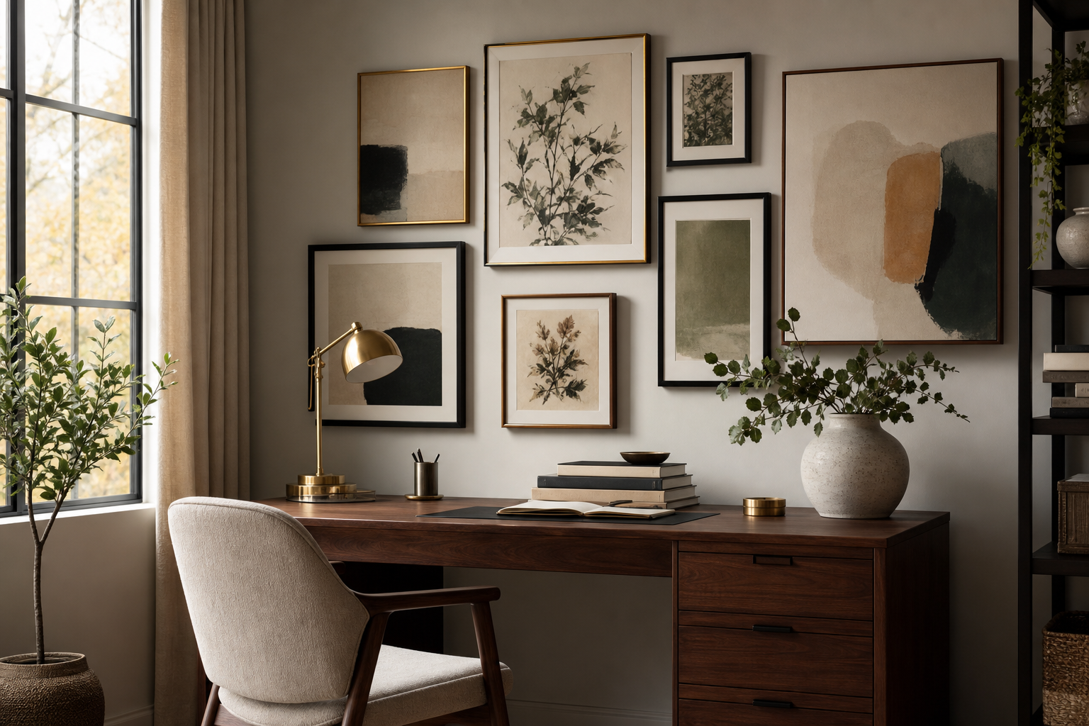
Accessories should support the wall, not compete with it. If the gallery wall is above a console or desk, keep styling low — a lamp, two or three books, and one sculptural object is enough. Repeating one color from the art in a cushion, vase, or rug helps the arrangement feel integrated across the room.
A piece with movement or color contrast can be useful when a gallery wall feels too flat. One well-placed accent does more than three average fillers.

Final thoughts
A polished gallery wall comes down to six decisions: the right wall, a clear mood, a cohesive art mix, a tested layout, frames with discipline, and careful hanging. Follow those in order and the process becomes much easier.
If you are wondering how to create the perfect gallery wall (step-by-step), the answer is not more art — it is better editing. Measure first, repeat key colors, keep spacing steady, and let every piece earn its place.