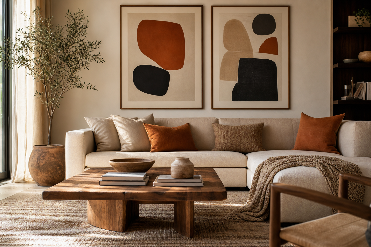
If you are learning how to choose abstract art for your home, start by treating art as part of the room's structure, not its afterthought. Abstract pieces shape pace, balance, and energy faster than almost any accessory because they sit at eye level and carry broad fields of colour, line, and movement. A room with soft edges and pale tones feels slower; one with strong contrast and sharp geometry feels more active. That is why the best piece is rarely the one that "matches everything"—it is the one that gives the room a clear emotional direction.
Abstract art is also one of the easiest categories to use across different interiors. It can sit comfortably in a calm bedroom, a layered living room, or a hard-working home office because it does not depend on literal subject matter. Our abstract collection is broad enough to cover subtle tonal work, energetic colour fields, and graphic compositions, while minimalist art prints help when you want a cleaner, quieter result.
Start with the feeling you want the room to have
Before you compare colours or sizes, decide what the room should feel like for 80% of the time. In a bedroom, that is usually calm, grounded, and low contrast. In a dining area, it may be warm and social. In a workspace, focus and clarity matter more than softness. This is the first real step in how to choose abstract art for your home because mood narrows the field quickly.
For a relaxed atmosphere, look for washed edges, open composition, and low-to-mid contrast. Think sand, chalk, clay, muted blue, dusty rose, or off-white. Pieces with visible texture but restrained movement tend to quiet a space rather than dominate it. If you prefer a room that feels sharper and more energetic, go for directional marks, stronger black accents, bold red, saturated cobalt, or geometric rhythm.

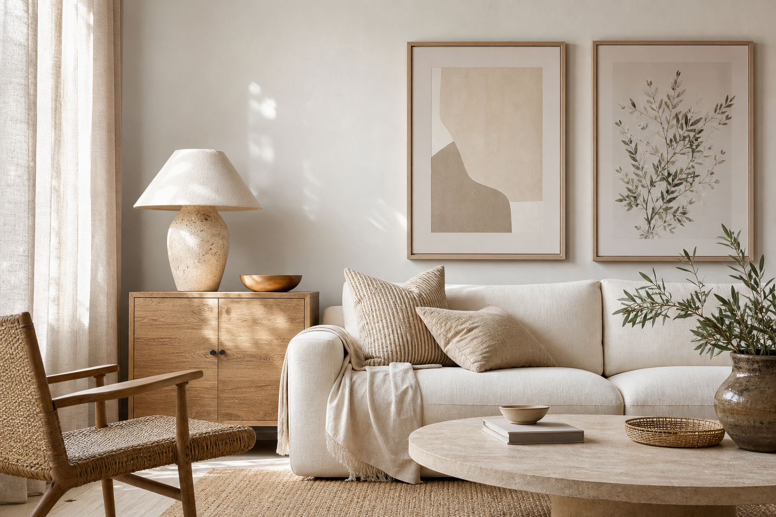
A soft piece such as Blush Watercolor Abstract works well when the room already has tactile materials—linen curtains, boucle upholstery, pale oak, brushed brass. Its value is not just colour; it prevents the wall from feeling flat while keeping the room light. If your style leans more serene than decorative, you can also pair abstract work with mindfulness-inspired wall art to keep the mood steady and uncluttered.
Choose colours that work with your existing palette
A useful rule is 60-30-10. If roughly 60% of the room is your main tone, 30% is a supporting tone, and 10% is accent colour, abstract art should usually repeat at least one of those groups. That does not mean exact matching. It means the piece should acknowledge the room. If your living room uses beige, walnut, and black, a print with beige and black plus one unexpected rust or sage note will feel connected. A random neon palette will probably feel dropped in.
There are two reliable approaches. The first is coordination: pick art that echoes the room's established tones within a tighter range. This makes the space feel cohesive and expensive because nothing fights for attention. The second is contrast: use the art to introduce one stronger colour that already appears somewhere small—perhaps in a cushion, vase, book spine, or rug detail. Repeating even 5-10% of a colour elsewhere in the room is often enough.



If your room needs lift, cooler tones such as teal and crisp white can add freshness without feeling cold. The Yin Yang Teal Abstract is a good example of contrast that still reads as balanced. If your room already has enough neutral furniture and needs a focal point, a piece such as Colorful Stained Glass Abstract can carry the colour burden for the whole wall. For quieter interiors, Textured White Abstract keeps visual interest while staying within a restrained palette.
Think about scale, wall space and placement
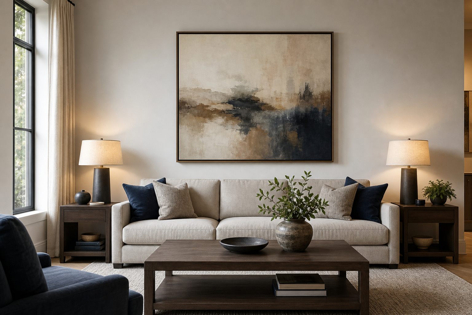
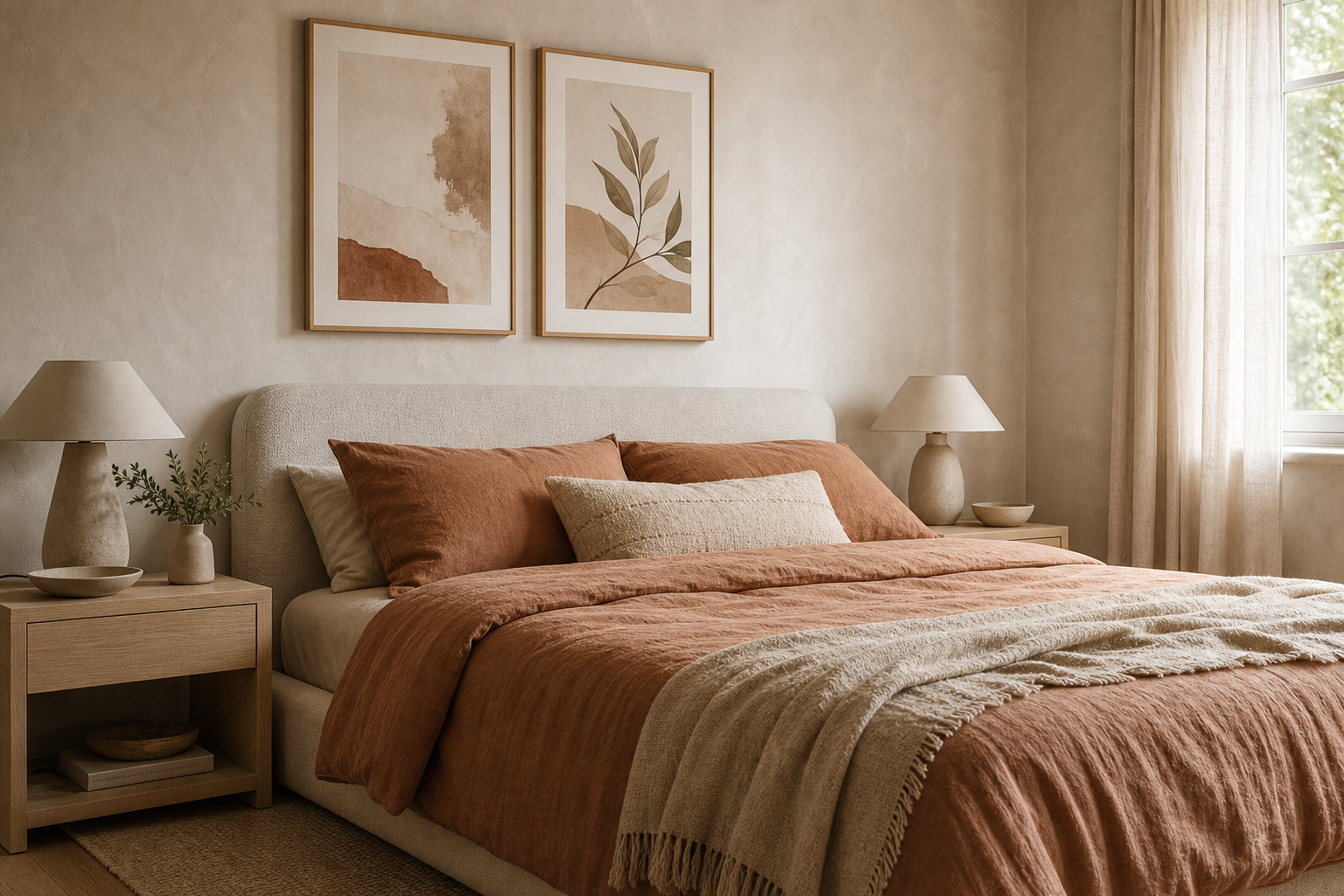
Good art in the wrong size always looks accidental. Over a sofa, aim for artwork that spans about 60-75% of the sofa width. A 200 cm sofa usually suits art or a grouped arrangement around 120-150 cm wide. Over a bed, keep the composition roughly two-thirds the width of the headboard. In a hallway, narrower vertical formats often work better than one oversized horizontal piece because they respect movement and sightlines.
Height matters as much as width. The centre of the artwork should usually sit around 145-150 cm from the floor in spaces where you view it standing. Above furniture, hang the bottom edge around 15-25 cm above the top of the sofa, headboard, console, or sideboard. More than that and the art starts to float away from the furniture; less than that and it can feel cramped.
If you are filling a blank wall, it is usually better to go larger than you think. Many people choose pieces 20-30% too small on the first try. One 70x100 cm work can feel substantial in a compact room, but a larger wall may need 100x150 cm or a pair of 50x70 cm prints with 5-8 cm between frames. If you prefer a cleaner arrangement, browse minimalist wall art for compositions that hold space without overwhelming it.

Radiant Light Burst is a strong option for transitional areas or social rooms because the movement reads clearly from a distance. That matters in halls, open-plan spaces, and walls viewed from across the room, where subtle detail can disappear.
Match the style of the art to your interior
"Abstract" covers several visual languages, and the right one depends on your furniture, finishes, and architecture. Minimal abstract art uses fewer elements—single forms, restrained line work, broad empty space. It suits Scandinavian rooms, soft modern interiors, and homes with clean silhouettes. Geometric abstract art relies on shape, rhythm, and order. It pairs well with mid-century pieces, black metal details, and interiors with stronger structure. Browse mid-century modern art if your room includes walnut wood, tapered legs, and graphic forms.
Expressive abstract art uses sweeping marks, layered pigment, visible movement, and stronger contrast. It suits eclectic spaces, contemporary living rooms, and interiors that need more personality than precision. Textured abstract work is useful when a room is materially simple—painted walls, plain upholstery, few patterns—because it adds depth without adding clutter.

Textured Waves is a practical bridge between minimal and expressive styles. The composition has enough movement to animate a wall, but the texture keeps it grounded. In homes with natural finishes, it can sit beside bohemian art prints or soft neutrals without feeling too polished.
Frame, finish and format: what changes the final look
Framing changes the tone of abstract art more than most people expect. A slim black frame sharpens edges and adds definition—ideal for graphic or high-contrast work. Oak frames warm up cooler palettes and connect better with natural materials. White frames are useful when you want the art to blend into a pale wall rather than create a strong border.
Paper and finish matter too. Smooth paper tends to look crisper and more contemporary. A visible matte texture feels softer and more tactile. If the artwork itself has a textured or painterly look, that slight surface variation helps it feel richer up close. Unframed presentation can work in casual, youthful spaces, but framed pieces nearly always look more intentional in living rooms, bedrooms, and offices.
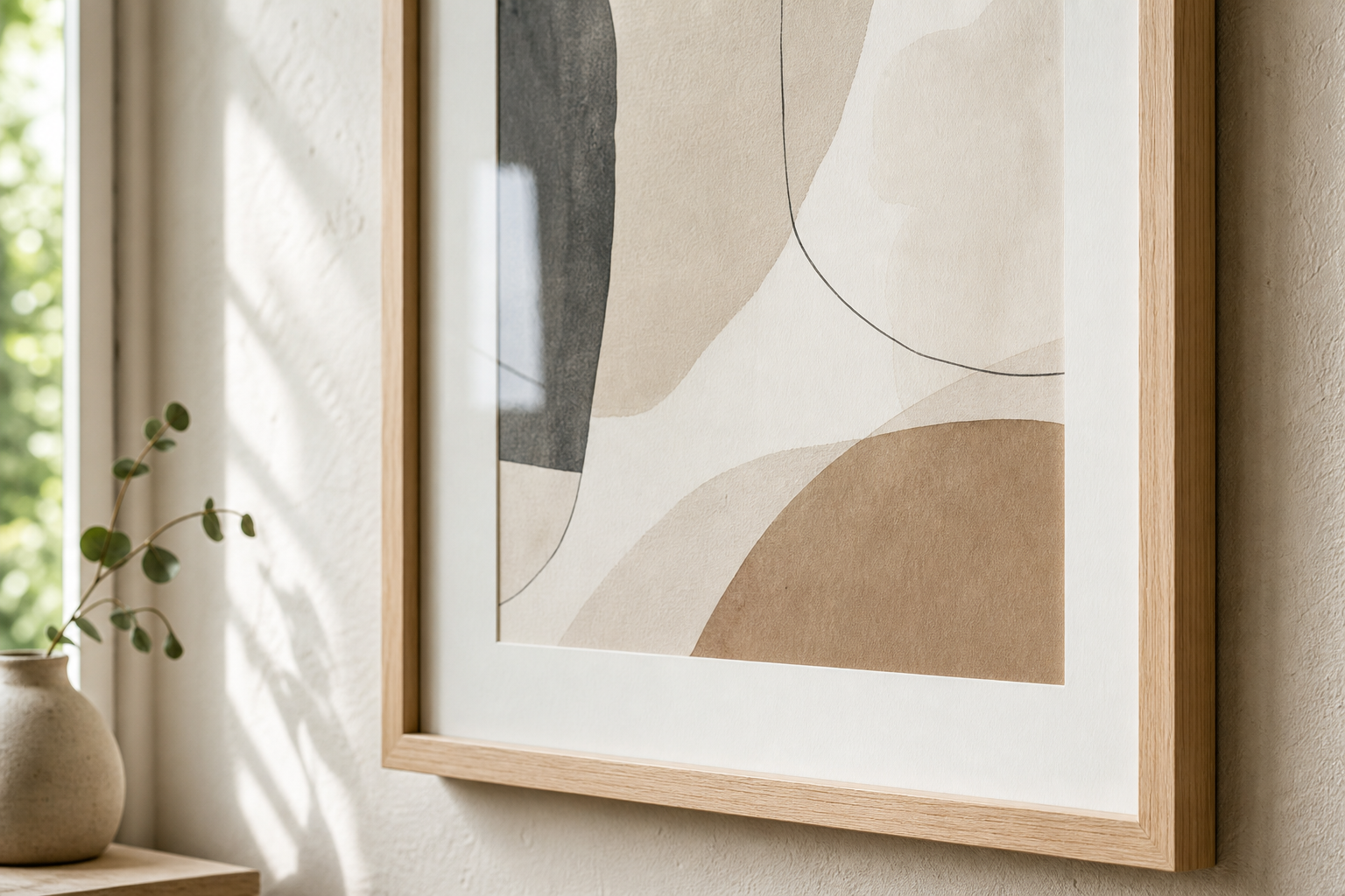
When mixing formats, keep one element consistent: frame colour, mount width, palette, or orientation. That consistency is what makes varied art feel curated rather than scattered. If you like monochrome texture, Textured Concrete Wall and similar pared-back pieces are useful references for a more architectural finish.
How to build a cohesive look room by room
In the living room, abstract art should usually anchor the largest seating wall. One statement piece above the sofa works in smaller rooms; a pair or a row of two to three works better on longer walls. Keep the palette tied to the rug, cushions, or curtains so the composition feels built in.
In bedrooms, lower contrast usually wins. The wall above the bed benefits from soft movement rather than aggressive geometry. Dusty neutrals, faded blue, muted terracotta, and off-black lines all work well because they add presence without making the room busy at night.
Kitchens and dining areas can handle bolder colour because the viewing time is shorter and the atmosphere is naturally more active. Graphic abstract prints near a breakfast nook or dining bench can make the room feel more designed without requiring extra decor. In a home office, choose pieces that feel focused. Too much visual noise at eye level can become tiring after a few hours.

Power Lines Abstract suits a workspace particularly well because the structure is clear and directional. It brings movement to the wall while keeping a disciplined, linear feel. If you are styling multiple rooms, repeat one idea across all of them—perhaps black frames, muted earthy tones, or one recurring accent colour. Then vary the intensity by room so the home feels connected but not repetitive. That same approach works beautifully when combining pieces from our abstract wall art range with selected fine art prints in adjacent spaces.
Final tips for choosing art you’ll love long term
The best way to decide how to choose abstract art for your home is to balance instinct with a few measurable checks. Ask three questions: does it fit the mood of the room, does it relate to the palette, and is it large enough for the wall? If the answer is yes to all three, you are usually close. If one answer is no, the piece may still be beautiful—but probably not right for that spot.
Trends move quickly, especially with bold colour combinations and novelty shapes. The pieces that last are usually the ones that still feel right when the room changes slightly—new cushions, different curtains, another rug. Choose art you would still want to see every day even if none of your guests commented on it. That is the standard worth trusting.
Final thoughts
Learning how to choose abstract art for your home comes down to mood, palette, proportion, and finish. Once those four are right, the room starts to look intentional rather than simply decorated.
A strong abstract piece does not need to explain itself. It just needs to belong to the space, hold the wall properly, and give the room a clearer point of view.